Dream South D
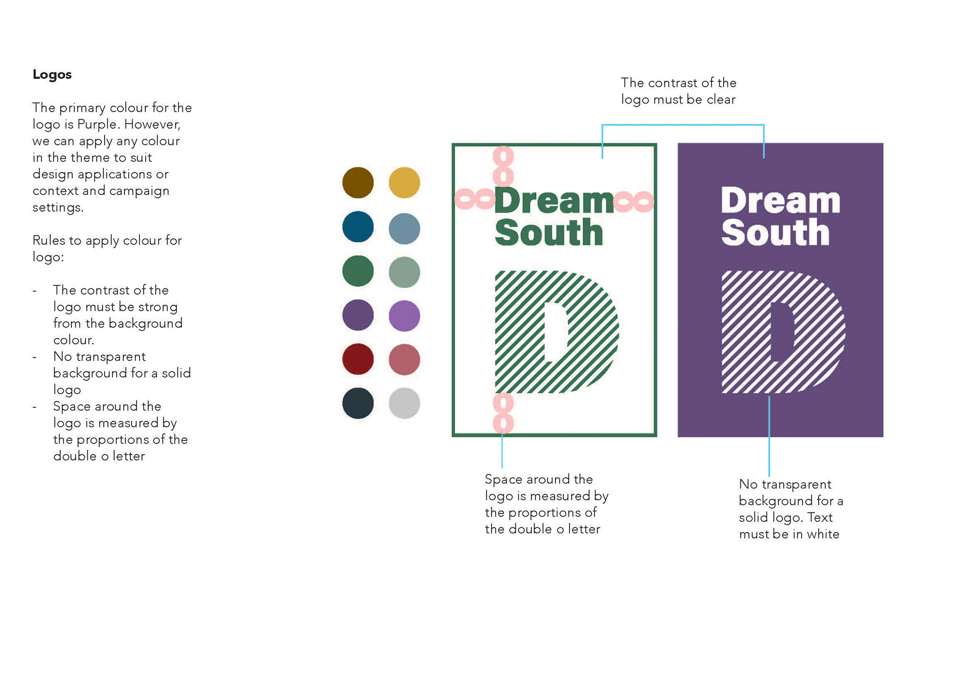
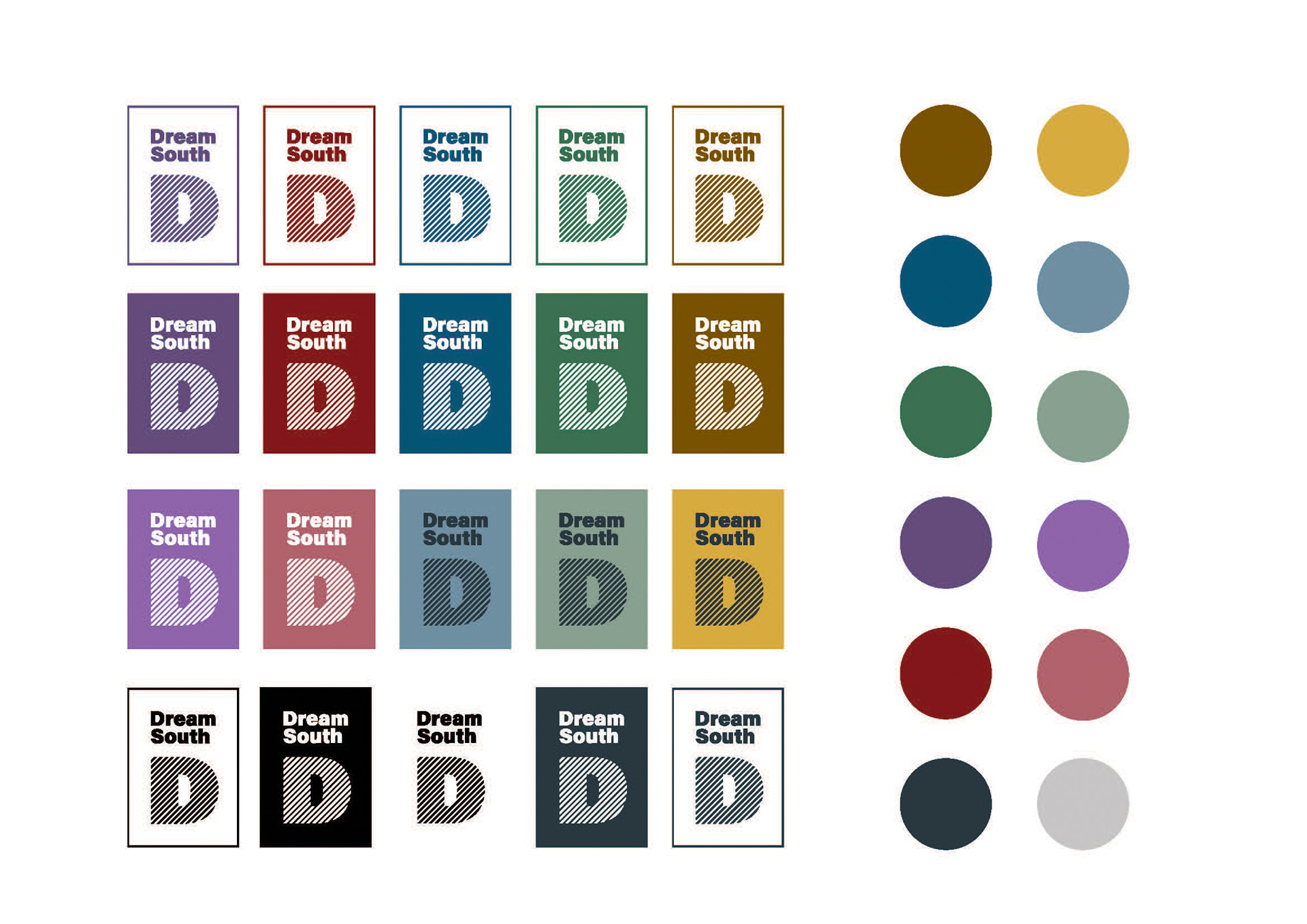
Brand Colour & Values
Brand Colour & Values
Purple is the primary colour of Dream South D. It symbolises creativity, imagination, and a shared vision, uniting individuality with community. Positioned between warm and cool tones, purple conveys balance, inclusivity, and connection.
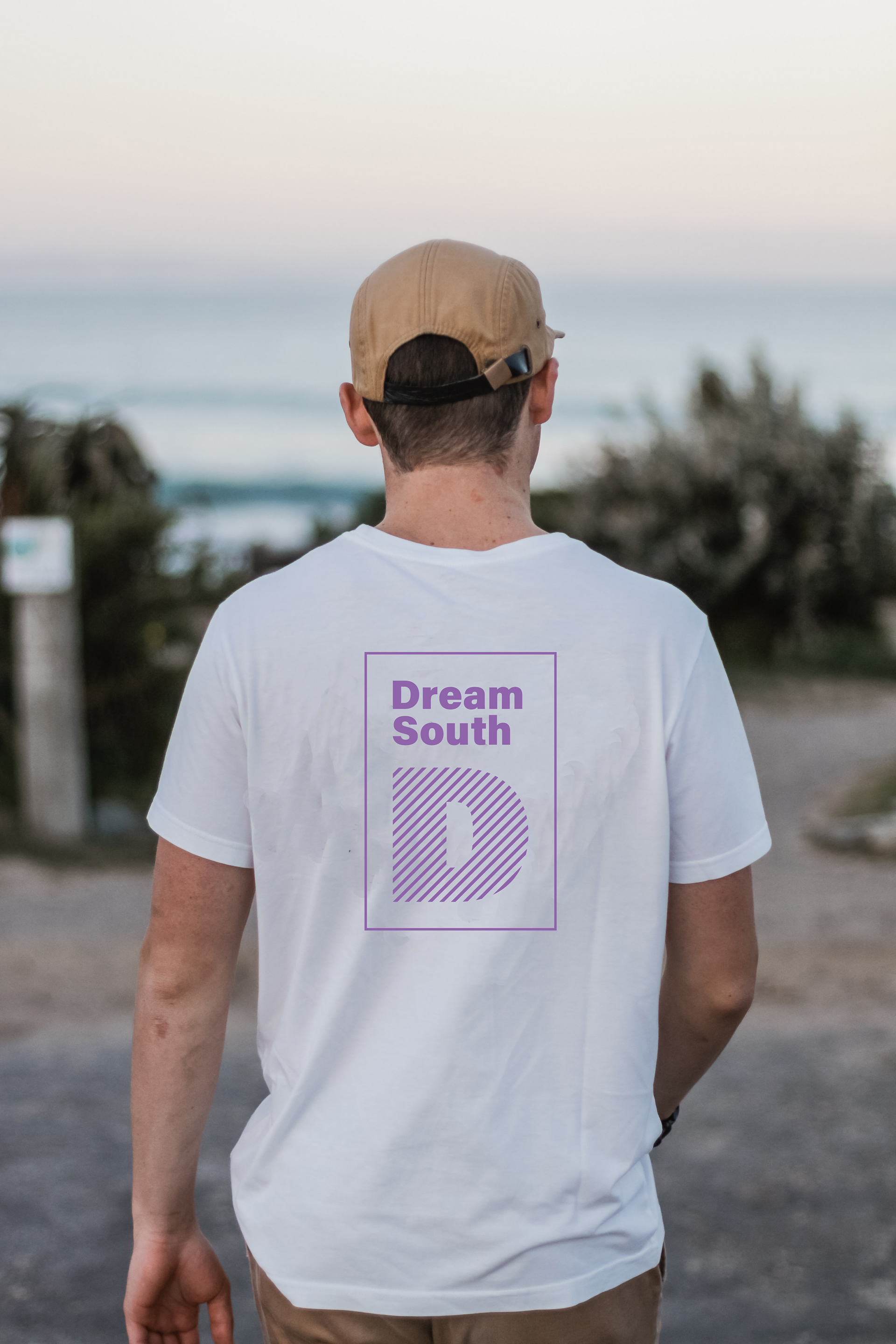
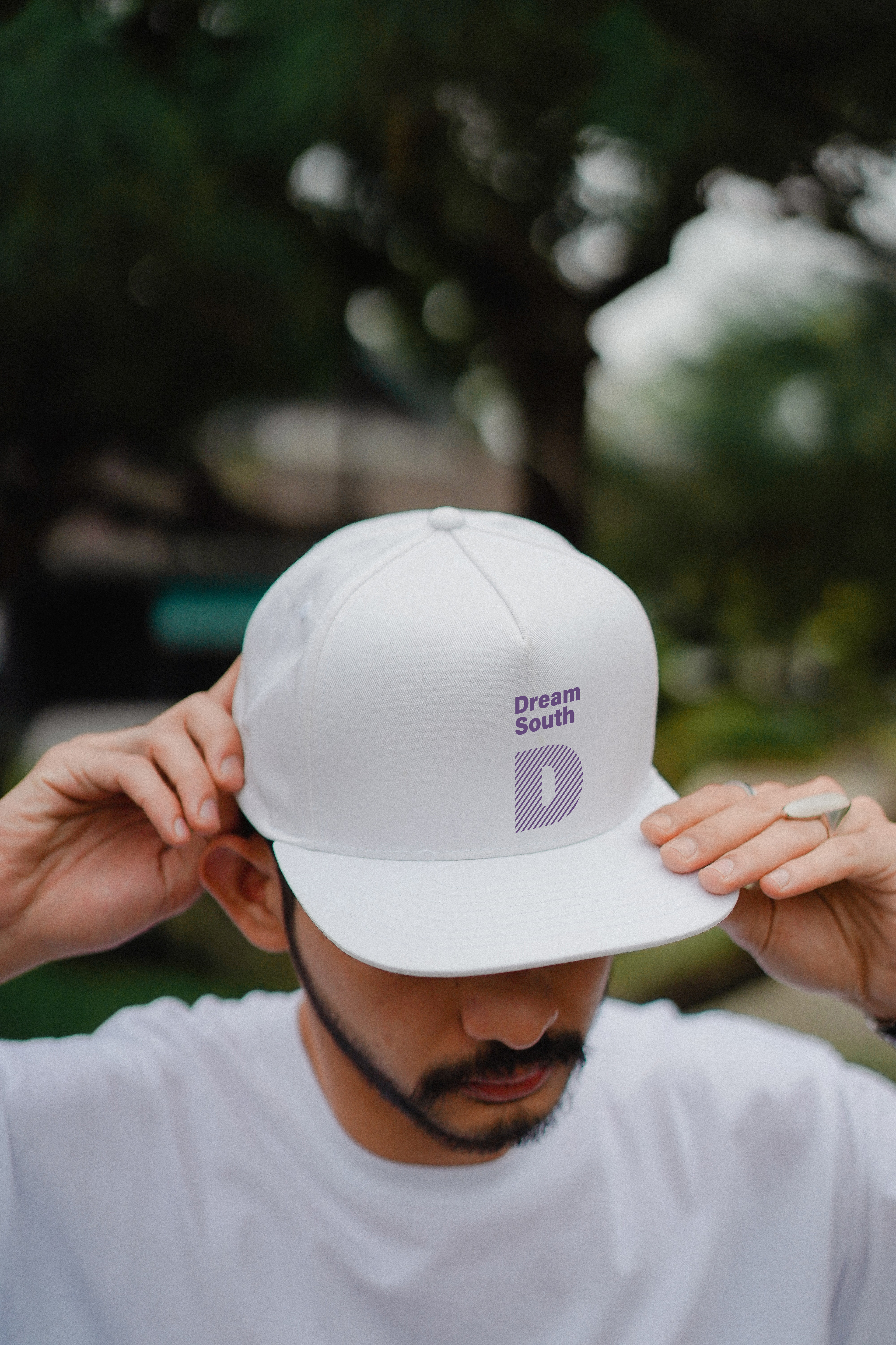
The logo system is designed to be flexible. Colours from a broader palette can be used across various themes and campaigns to represent diverse voices and contexts.
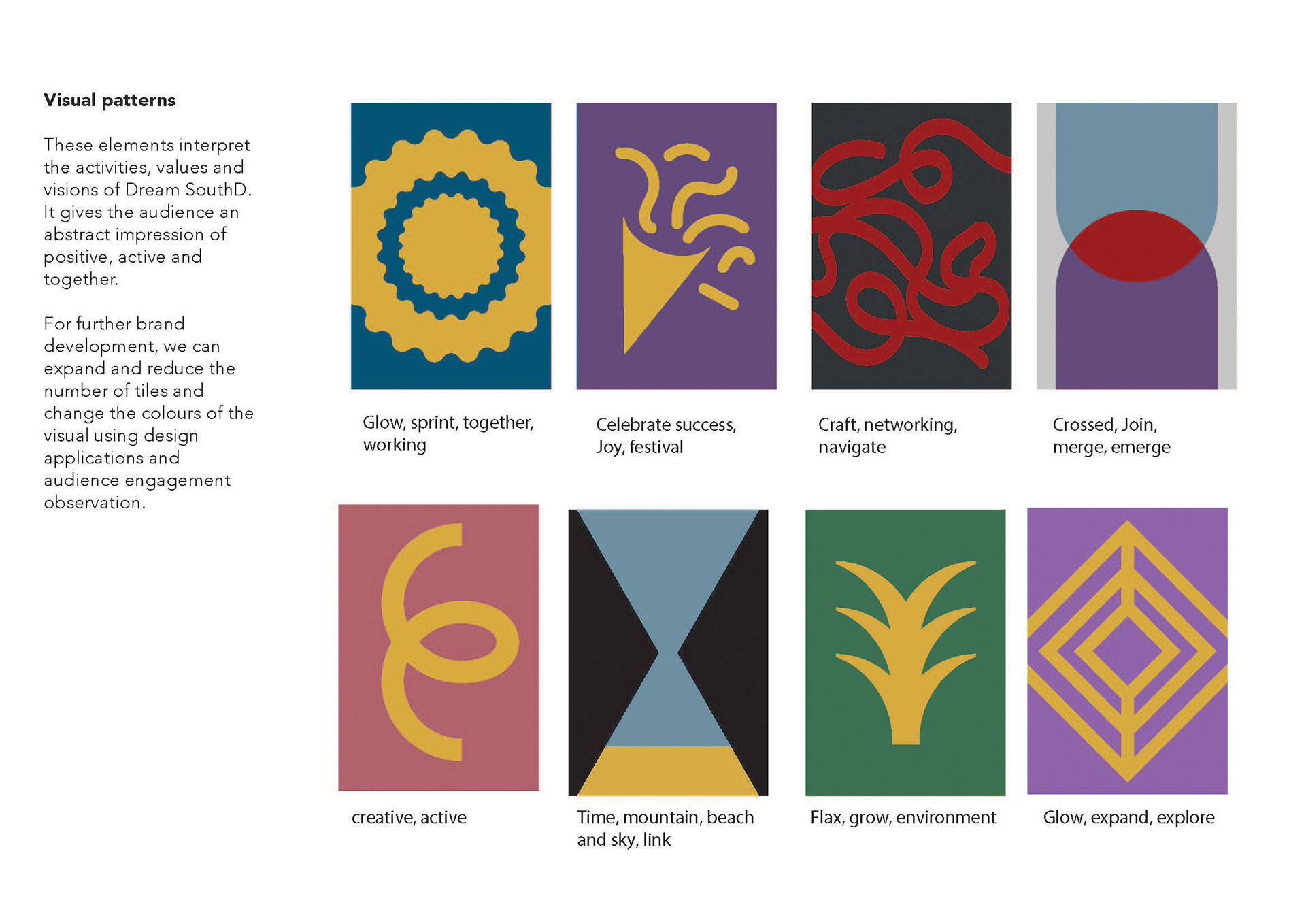
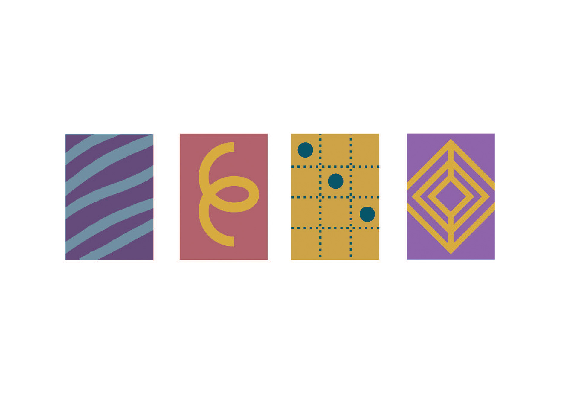
The modular tile elements represent community values and energetic vibes, illustrating how individual pieces come together to create something positive, dynamic, and interconnected. As Dream South D evolves, the tiles and colours can grow, adapt, or be simplified, allowing the identity to change alongside its people and engagement.


Case studies
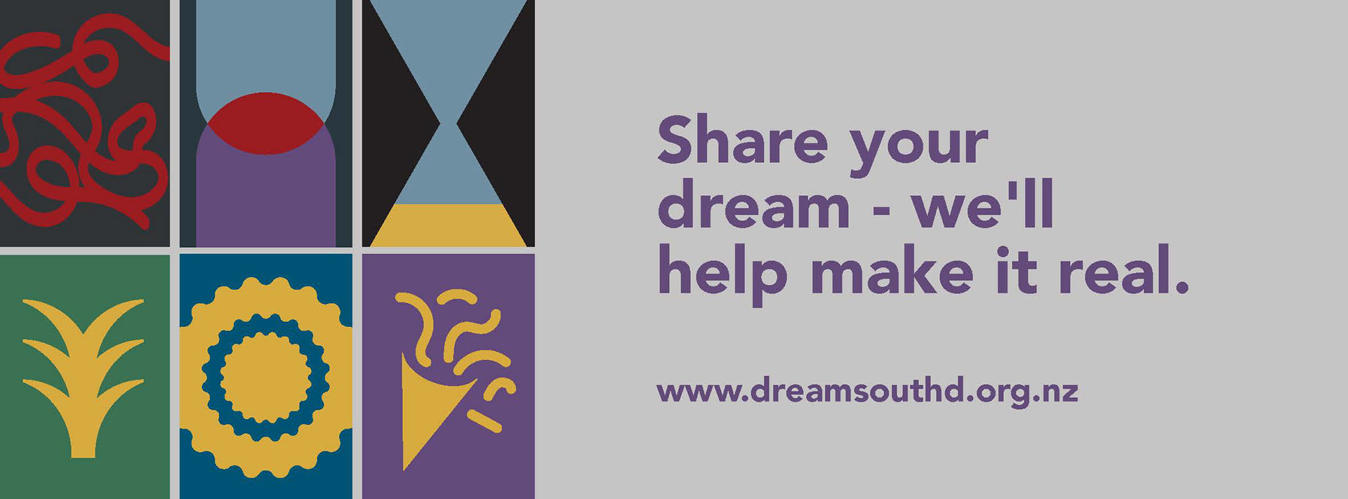
South Dunedin is a diverse area where people from various races share the same space. It is an inclusive community that celebrates individual uniqueness and cultural differences. These factors contribute to making South Dunedin a place where everyone is accepted and recognised in their own way.
However, South Dunedin faces many challenges, both ecologically and economically. Despite these obstacles, this vibrant community has many hidden gems that aren't widely known, including the oldest Chinese restaurant, the best tofu maker in Dunedin, delicious Turkish kebabs, Indian grocery stores, and a thriving Pasifika community with its churches.
King Edward Street is a distinctive avenue lined with art deco buildings, serving as a central hub for community activities.